CREATIVE PLACEMAKING: THE HEART OF A HEALTHY CITY
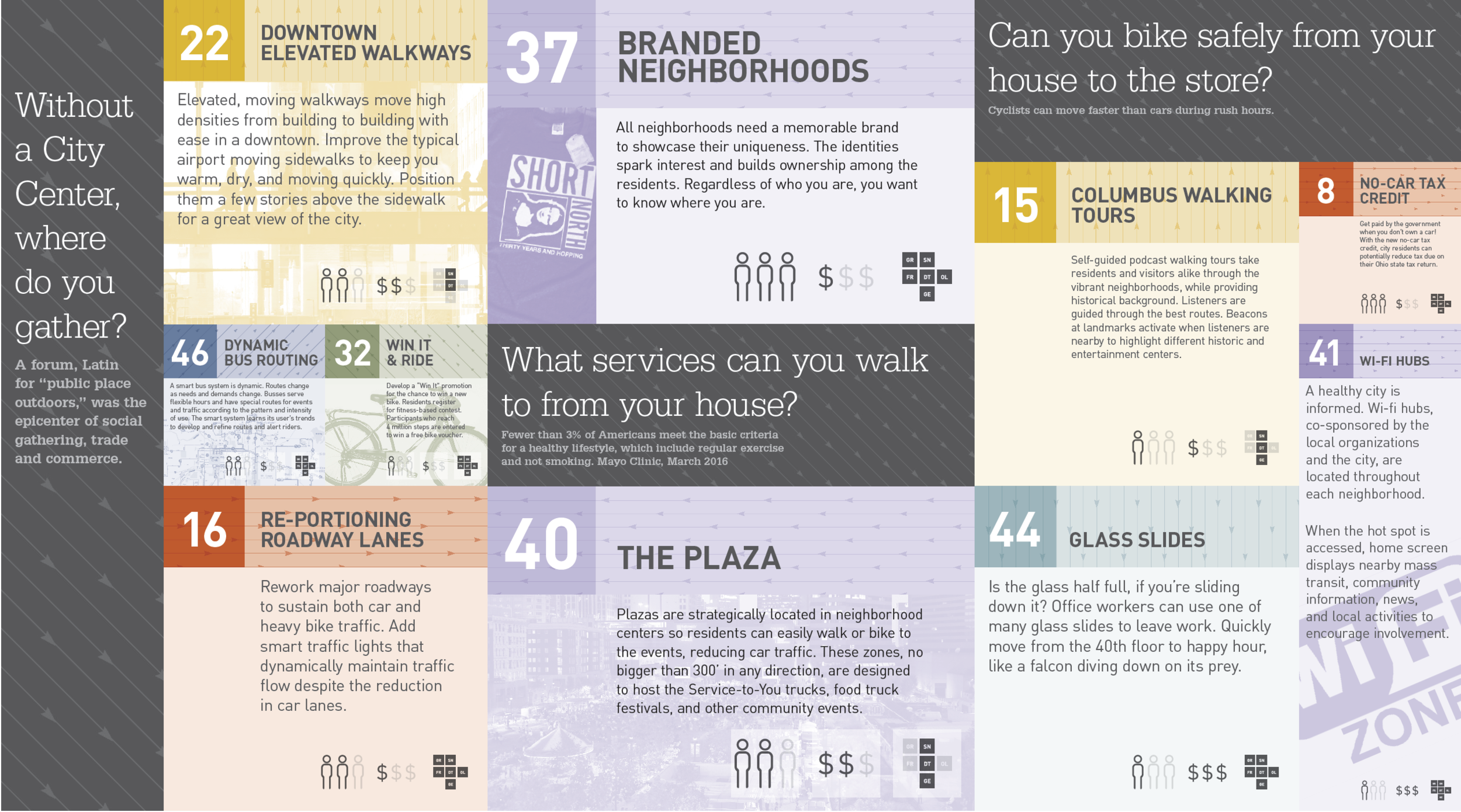
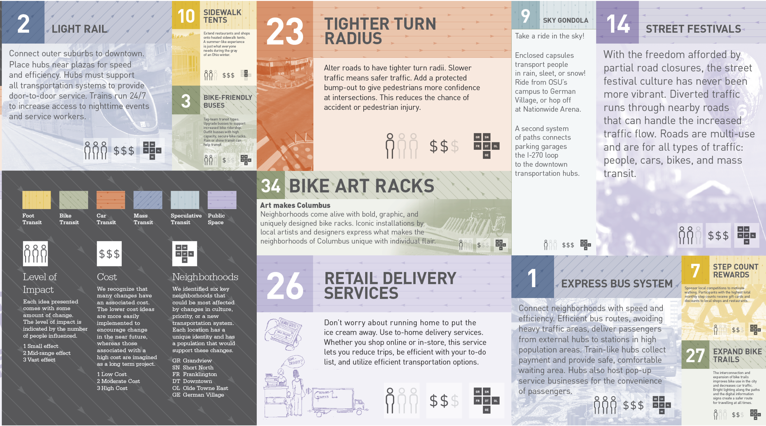
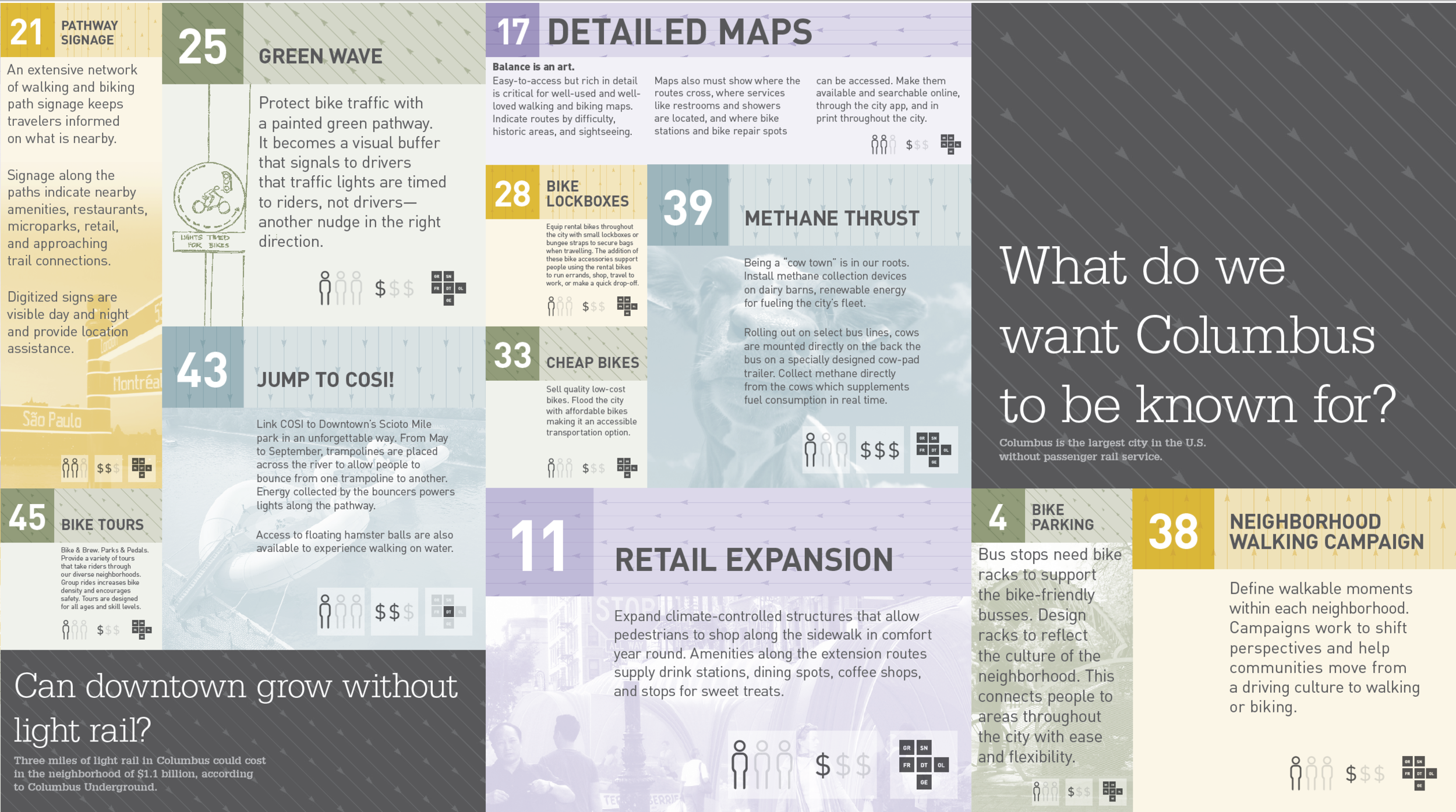
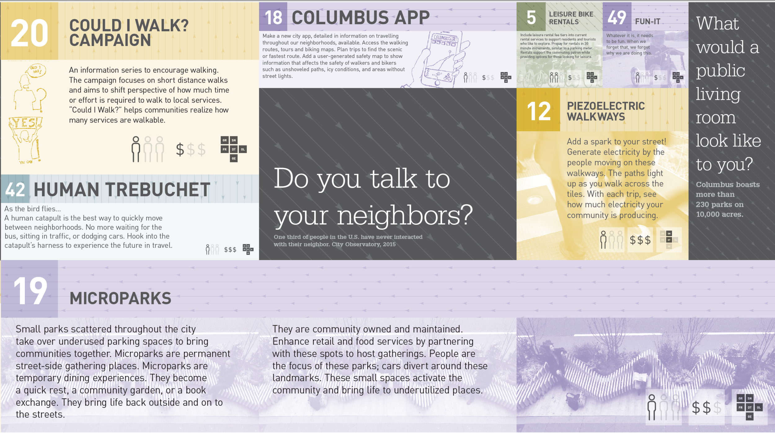
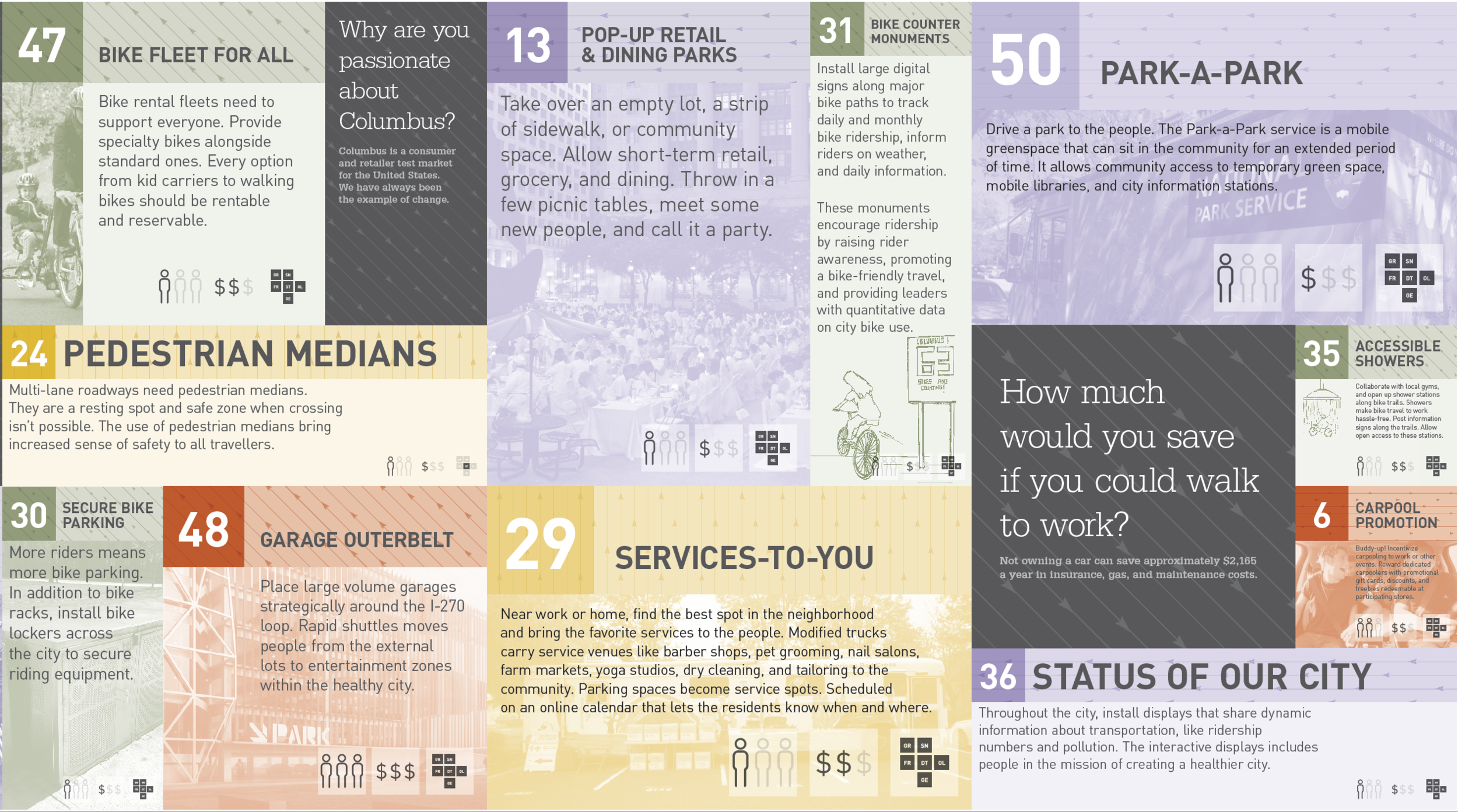
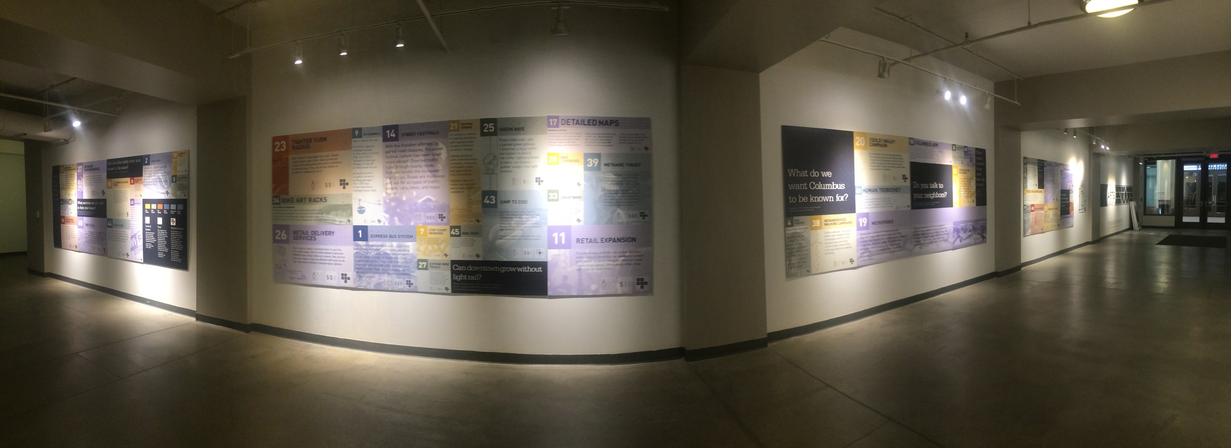
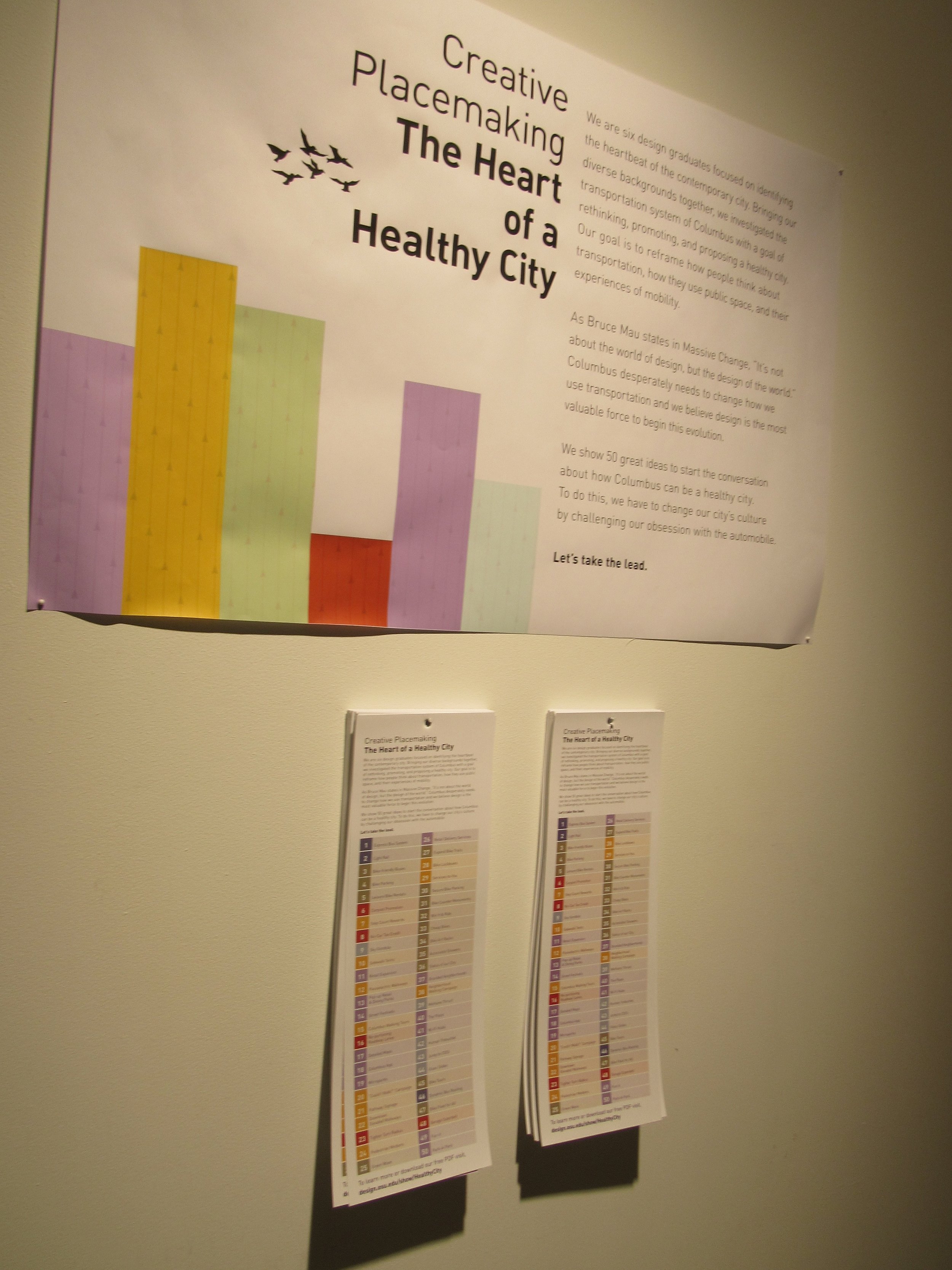
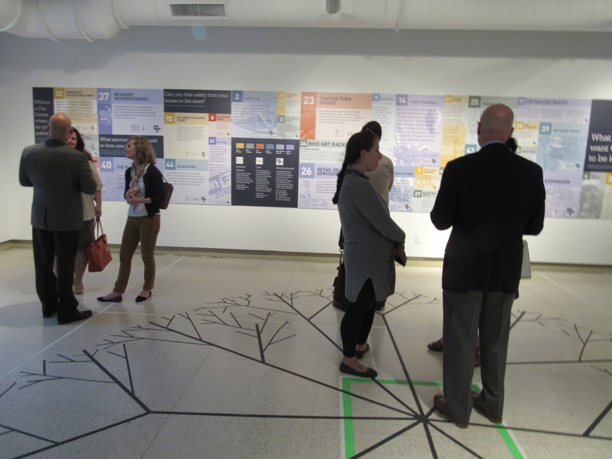
The exhibition 'Creative Place Making: The Heart of a Healthy City' was a successful design exhibition that was put up in collaboration with the the 2016 Barnett Symposium in Columbus, Ohio. Six graduate students from the Department of Design and a professor came together to identify what makes the heart of a healthy, contemporary city. Questions were asked about quality of life of the citizens, air quality, traffic congestion and exploration models, and service infrastructure through design research and working, visualization models and a thorough investigation and discussion of the opportunity space. Approaching the idea with varied student backgrounds such as graphic design, art, architecture, interior design, the exhibition highlighted 50 great ideas that were identified by the students to start a conversation about what will make a healthy future city. Our final deliverables consisted of an interactive design exhibition with posters, and a final booklet.
Graduate MFA students include Adam Fromme, Ece Karace, Emily Bell, Craig Turner, Hemalatha Venkataraman and Trisha Shah with Prof. Jeffrey Haase.
Download 'Creative Placemaking- The Heart of a Healthy City' Booklet here.
THE PROCESS
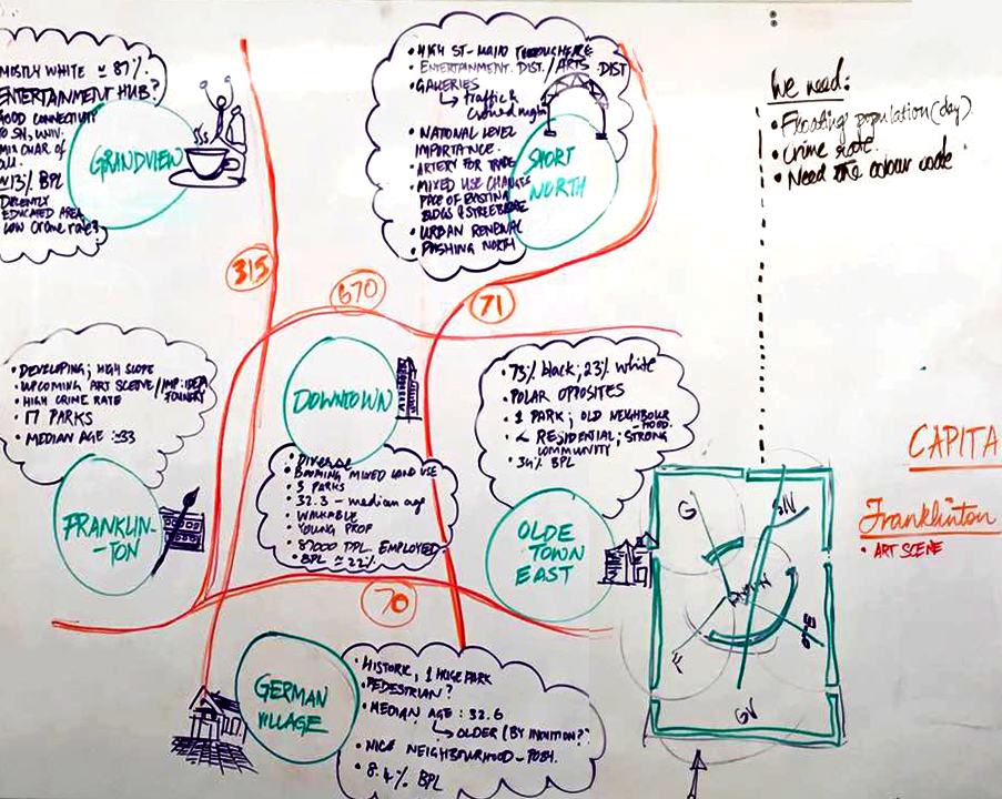
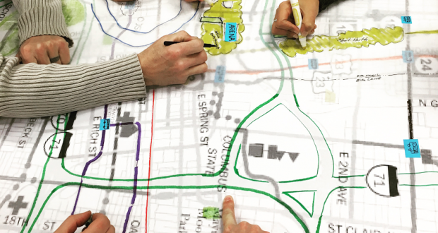
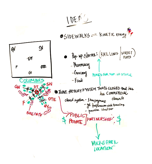
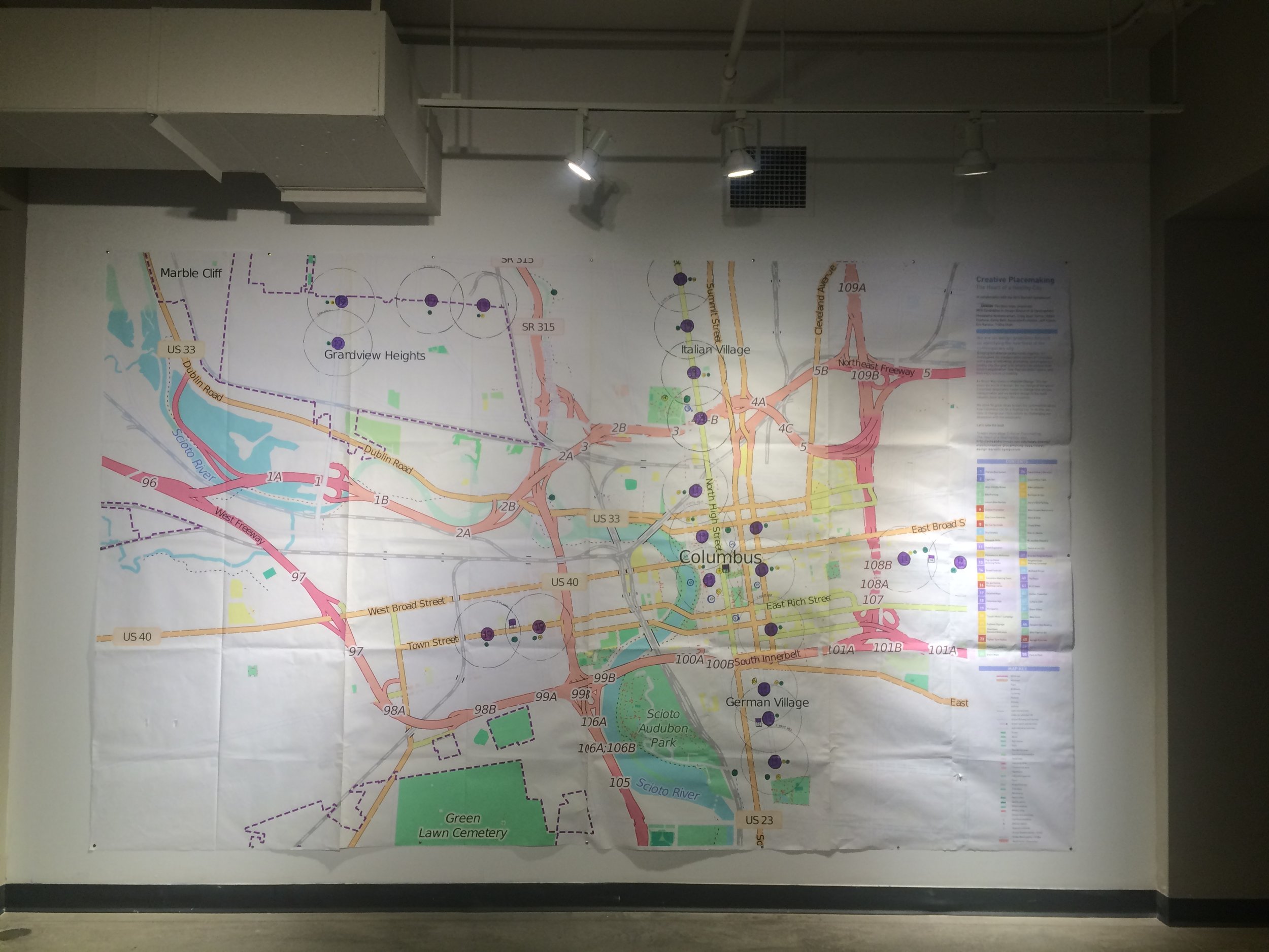
The process towards the final work in the exhibition was one of exploration. As a team, we were initially geared in on how we could explore the potential of Columbus as a healthy, contemporary city. We began with in-depth research about six main neighbourhoods in the city within a set perimeter and explored site-specific solutions and drives for each these areas. There was a turning point in the research wherein we had a long discussion about whether we make this a local, Columbus experience or take it beyond that for the idea of what we would like to see in Columbus. Inspired by an intensive discussion on Bruce Mau’s ‘Massive Change’ during one of our sessions, we began to look for setting up an interactive space that would initiate conversations within the community and ignite change through our ideas, design suggestions and sketches, that could be applied as experiments for a healthy city.
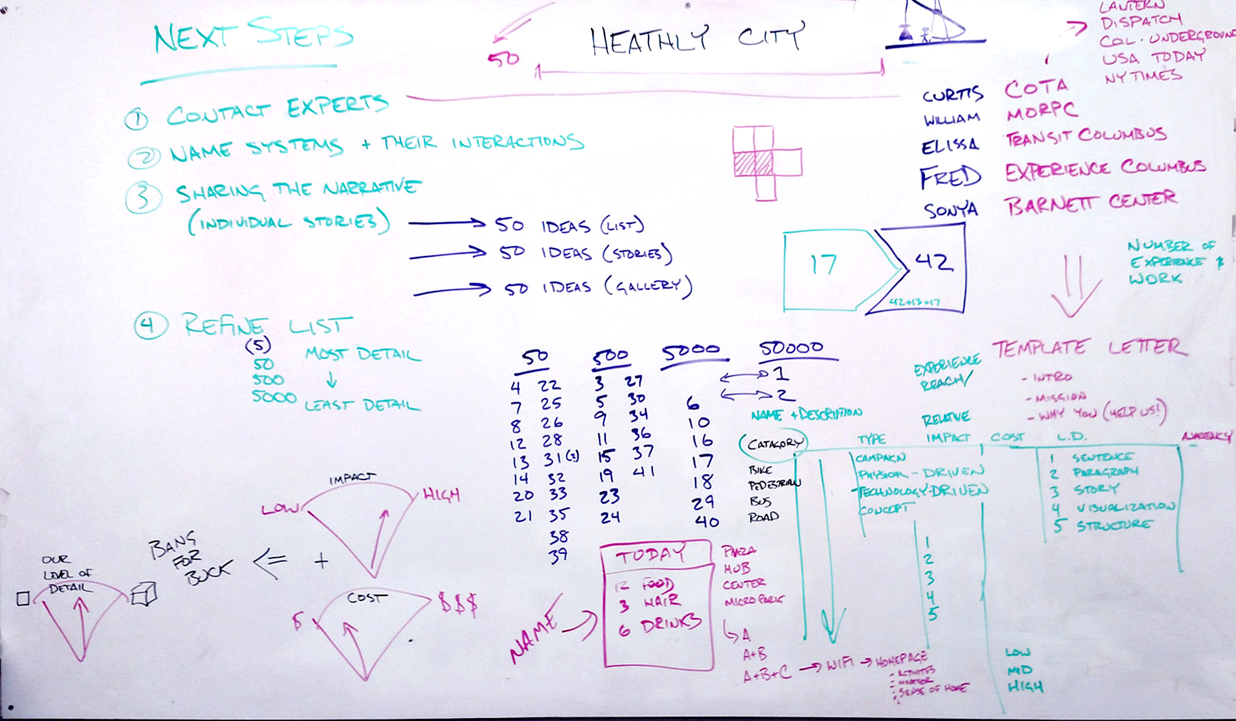
Reframing the approach allowed us to extend the project scope on three different levels of exploration that could be integrated into display for the show, to nudge people’s thoughts about a car-free lifestyle, pedestrian culture and improved experiences of public spaces.
5000FT view: Lists out the ’50 Reasons Why’ we don’t need to be car-reliant
500FT view: Broad brush stroke ideas on rapid/mass transit plans
50FT view: Close examination of specific walking or biking experiences
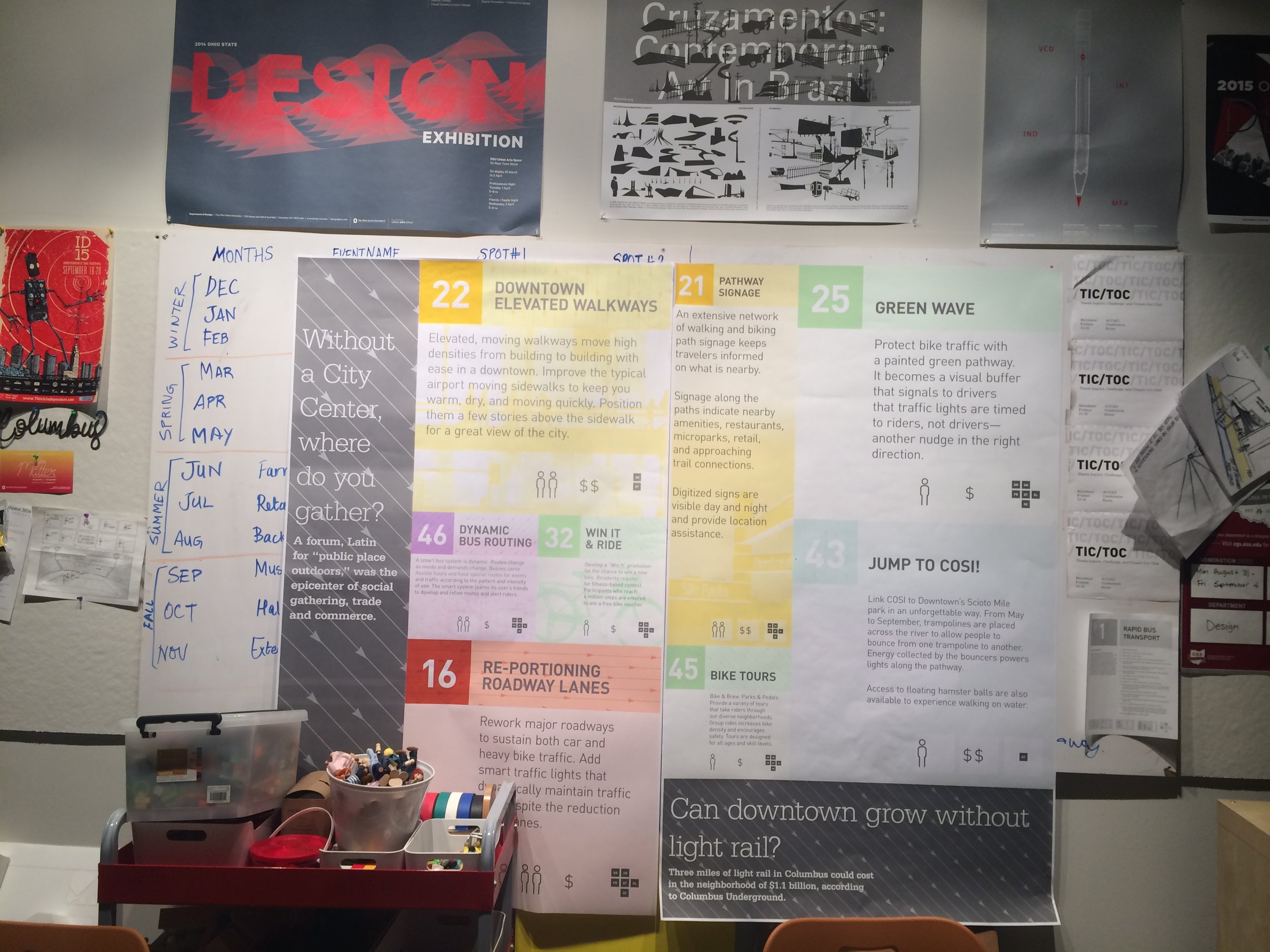
In the process of conducting heavy secondary research into working practices, ideas and commissions currently existing in the world, we split the knowledge bank into the following general categories: Bus, rail, bike, car, people, and speculative design explorations. They were all color-coded so that the final posters could be easily categorized and understood. Design-wise, videos, sketches, animations, the posters, abstract but live-exhibit experiences, audience-interactive pieces and booklets were created. It was a wonderful collaborative project with assigned roles, information and ideas coming together in perfect cohesion.
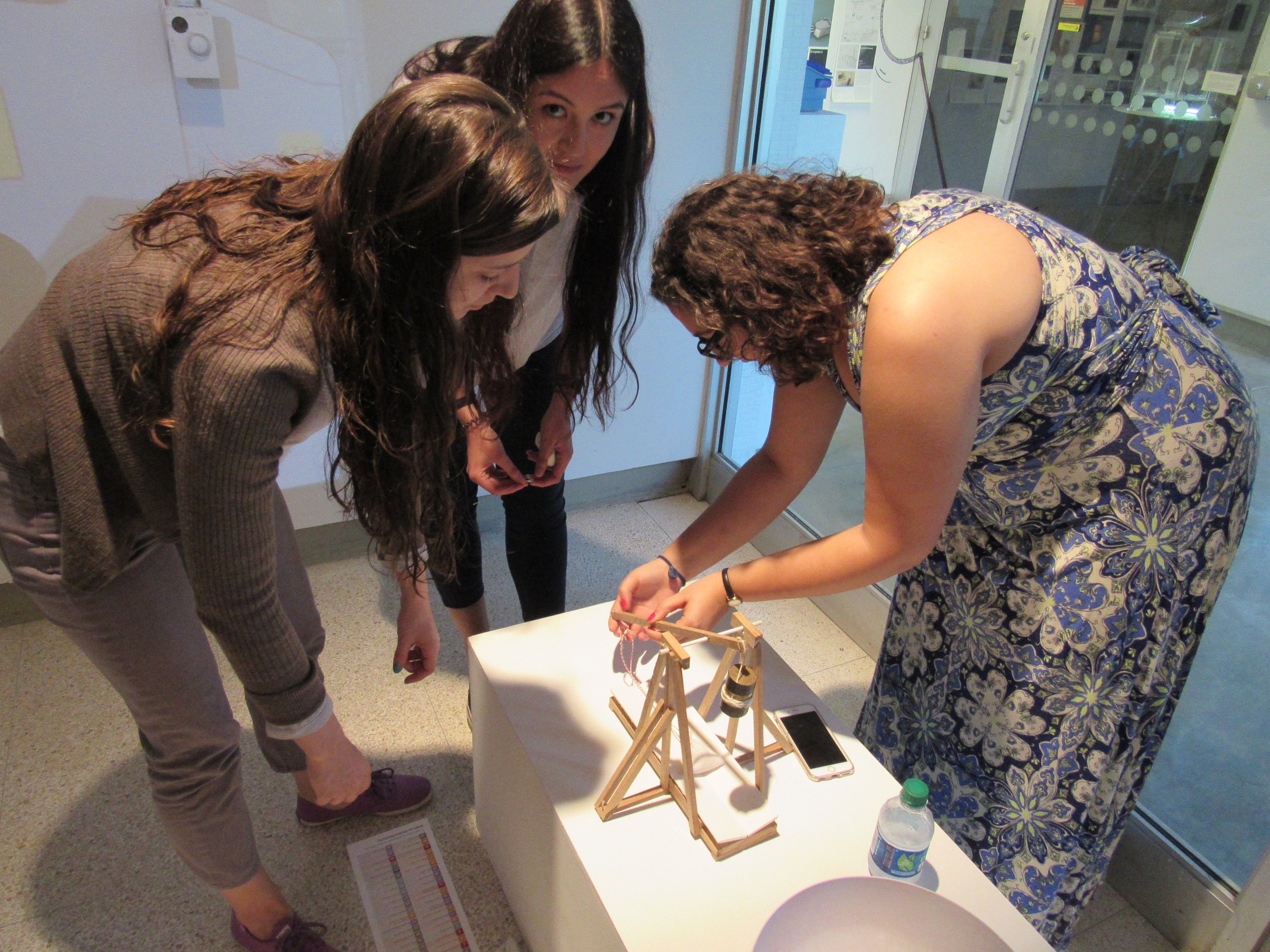
One of the more interesting categories is that of "Speculative" putting a fun spin on the tacking of these contemporary issues in which we explore design futuring solutions that sound absolutely ridiculous. We were introduced to this concept of "Design Futures, Speculative Designing" through an elective class we had taken up in our previous semesters with Dr. David Staley, professor of history and design futures at OSU. Some of the speculative ideas included 'the human trebuchet', sky gondola, methane thrust etc.
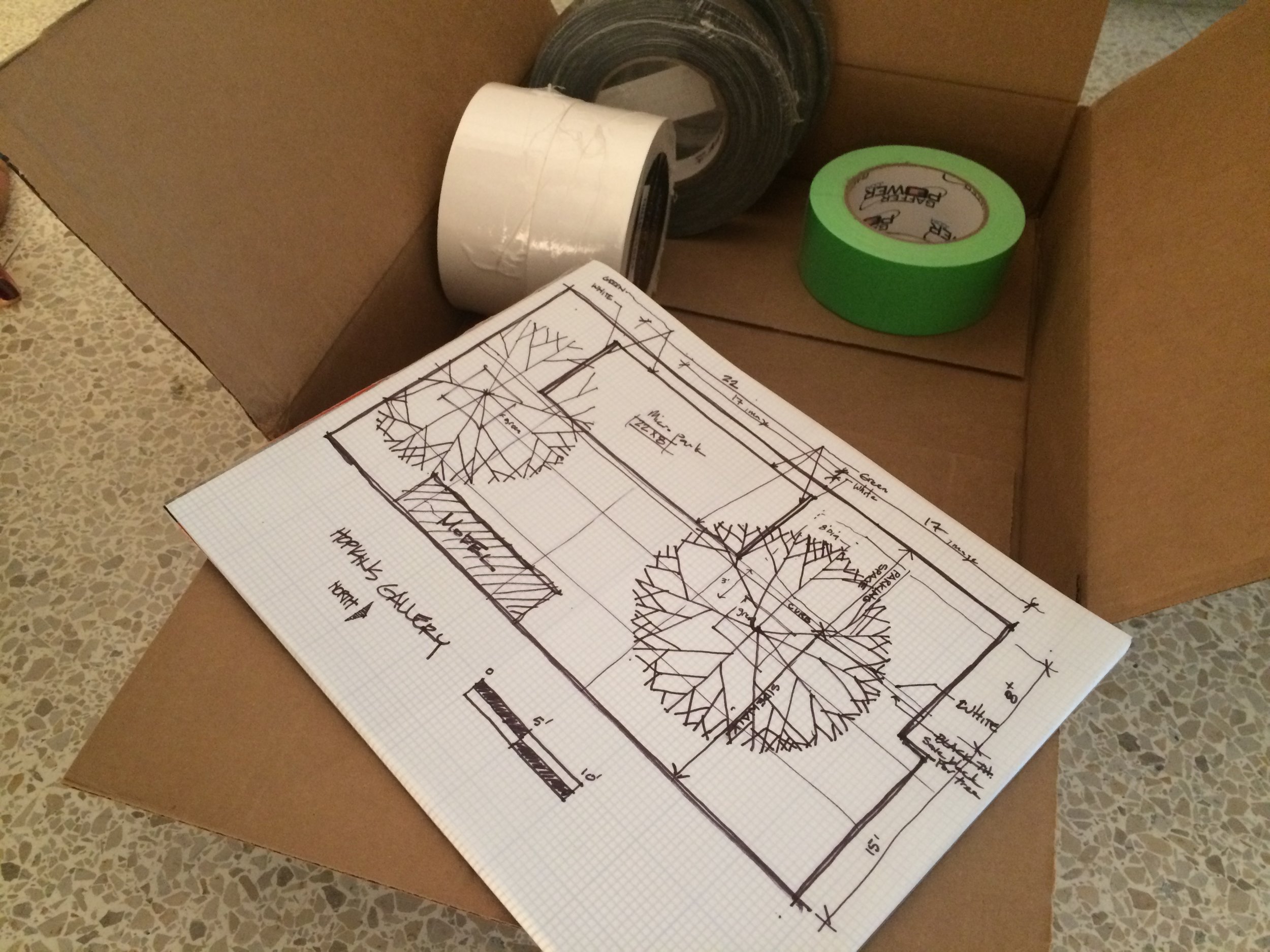
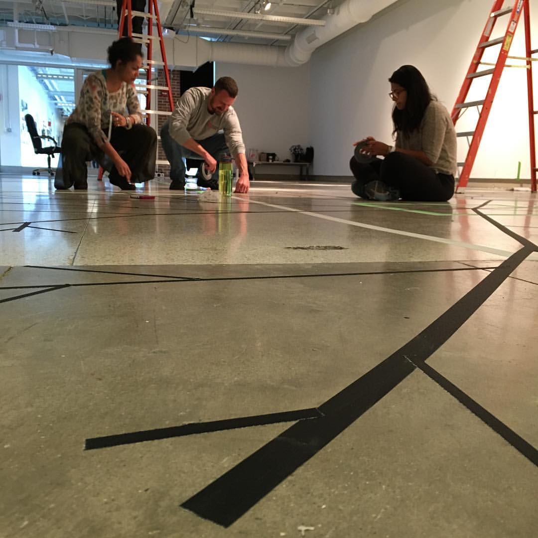
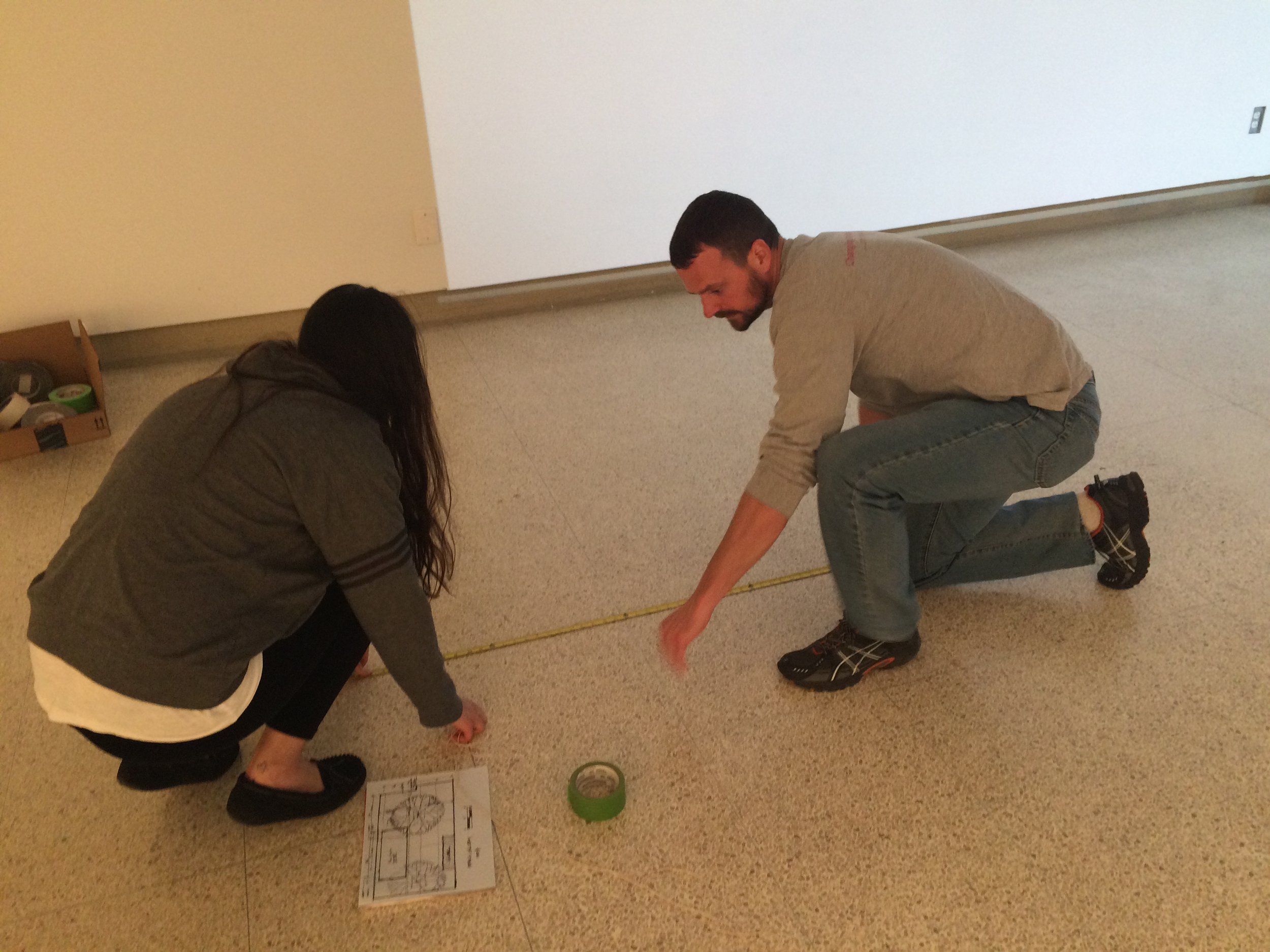
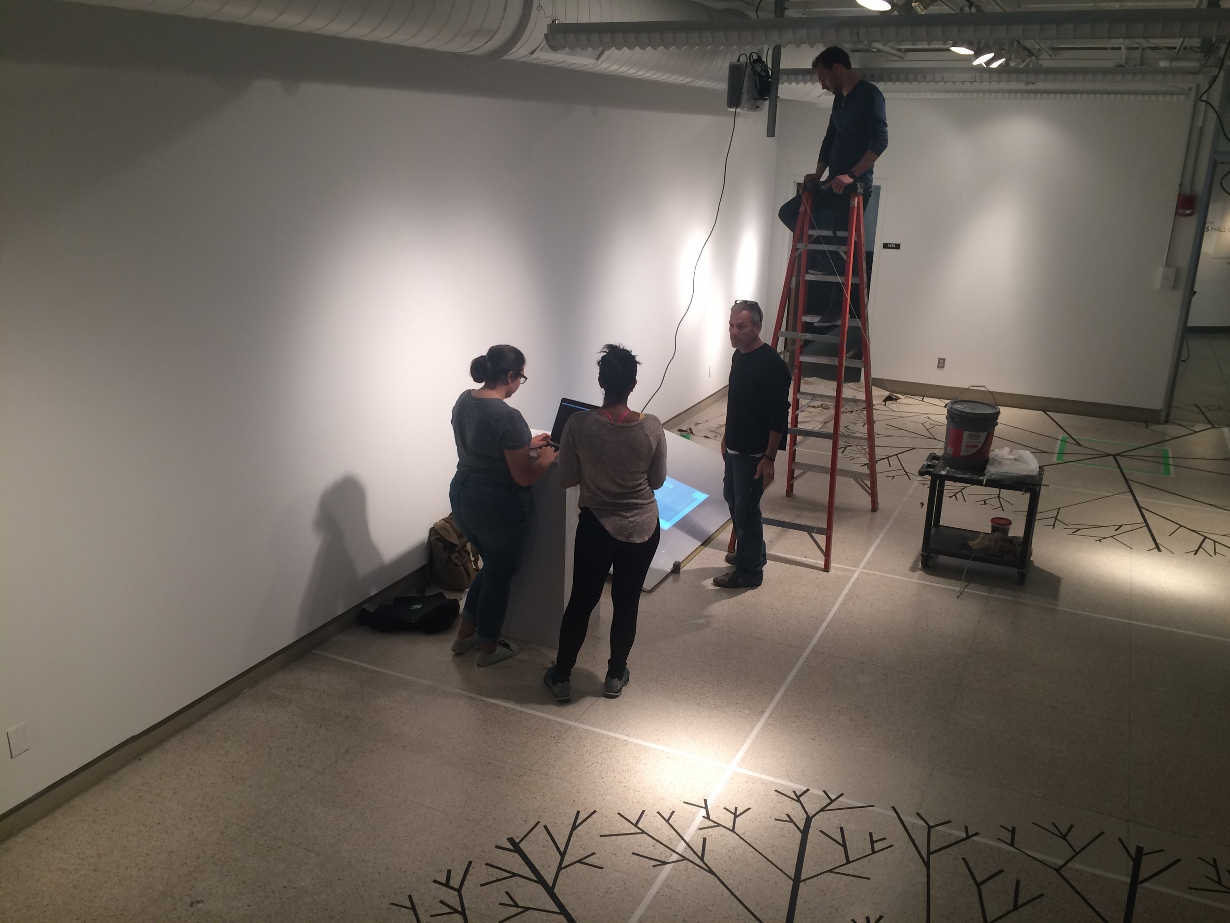
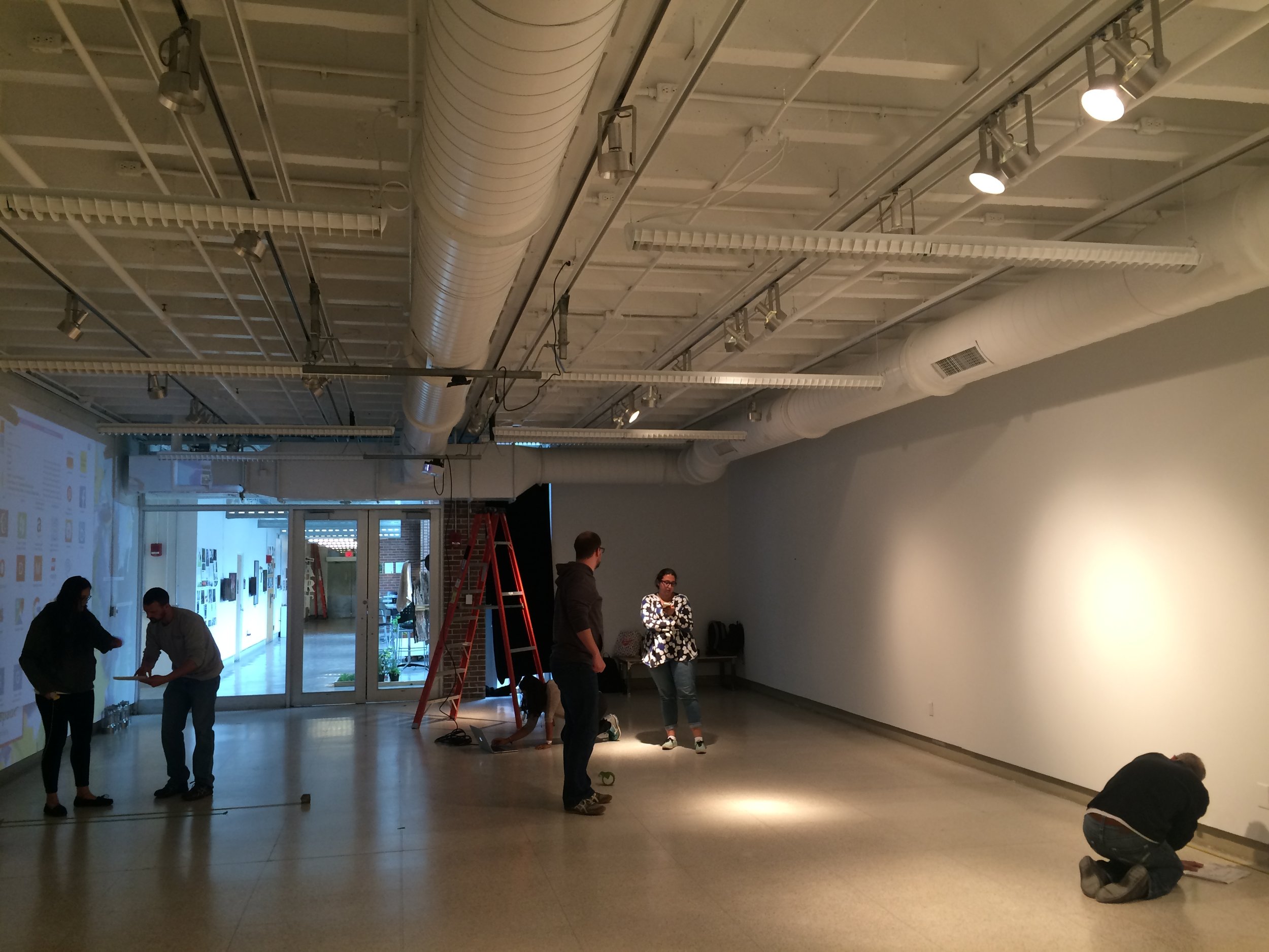
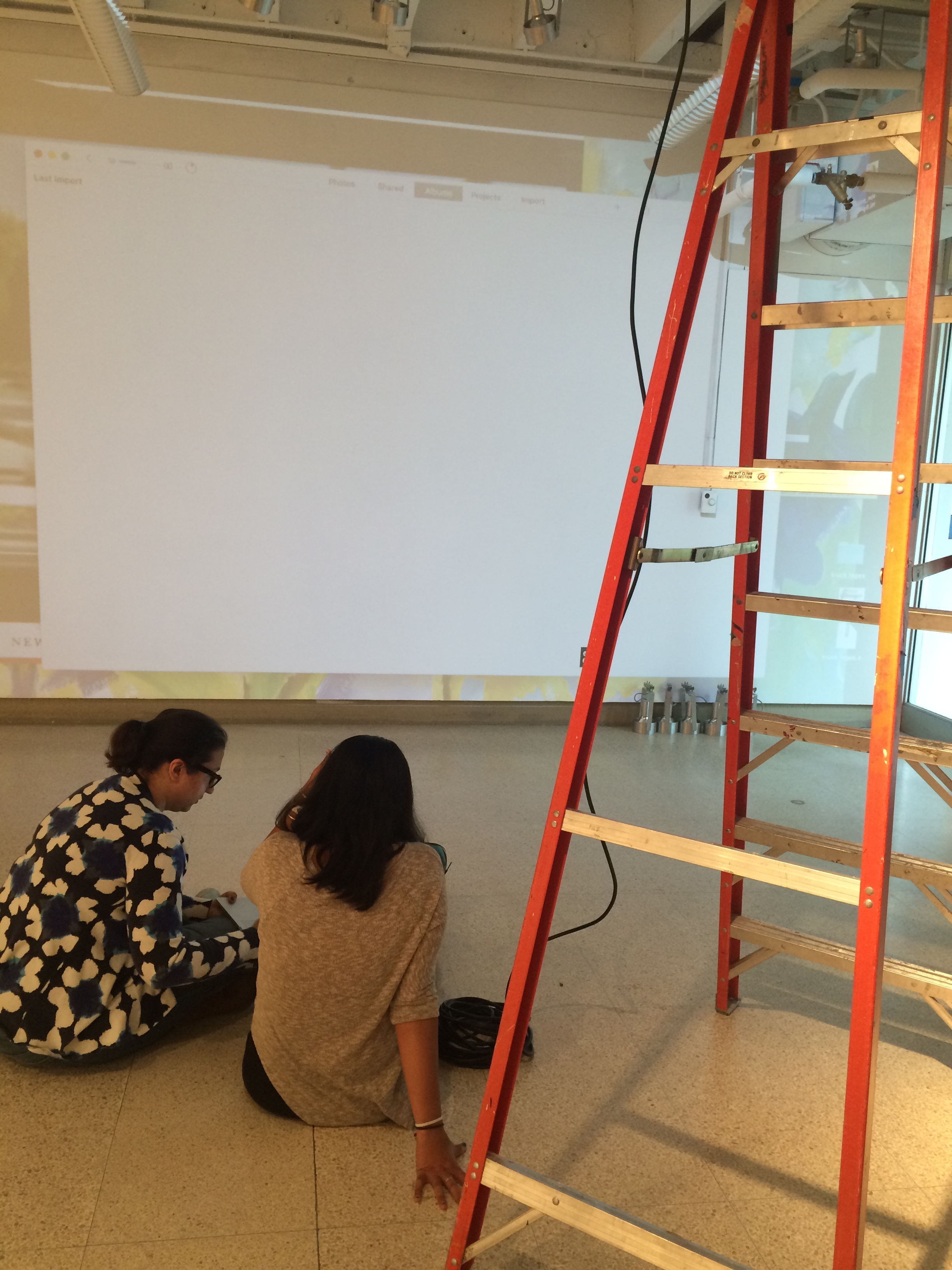
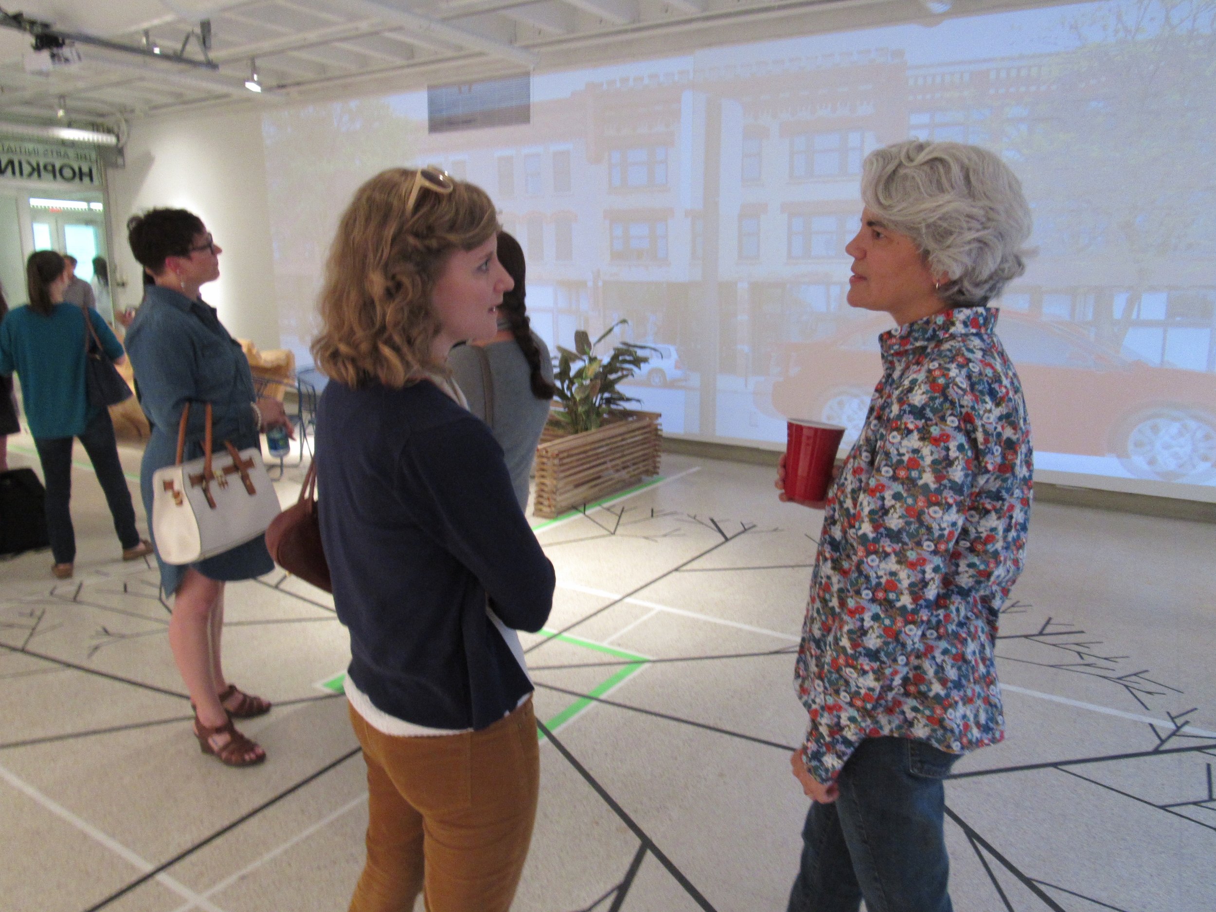
Set-up day had us working closely with the art gallery’s senior preparator to set up projectors for the wall projections (animations created by the team which would display prototypes for “food truck” and micro-park ideas of the exhibition), as well as a floor projection that explains the exhibit in conjunction to the live pieces and the posters. This was largely hands-on gallery work. This kind of a project allows us as researchers and designers to work with what we have with regards to simple budgets but maximum, creative output. This involved working with the constraints of the gallery space to create posters (prototyped several times before the final design was arrived at), set up live experiences, and interaction spaces.
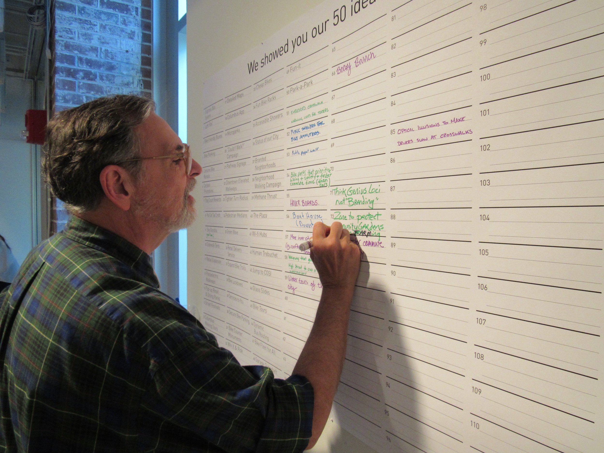
A quick look of how the ‘50 ideas’ posters was going to be setup in the gallery.
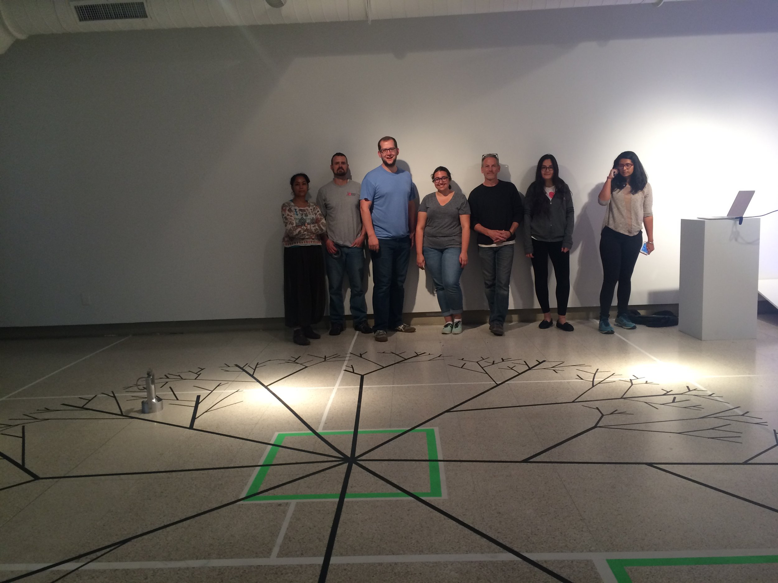
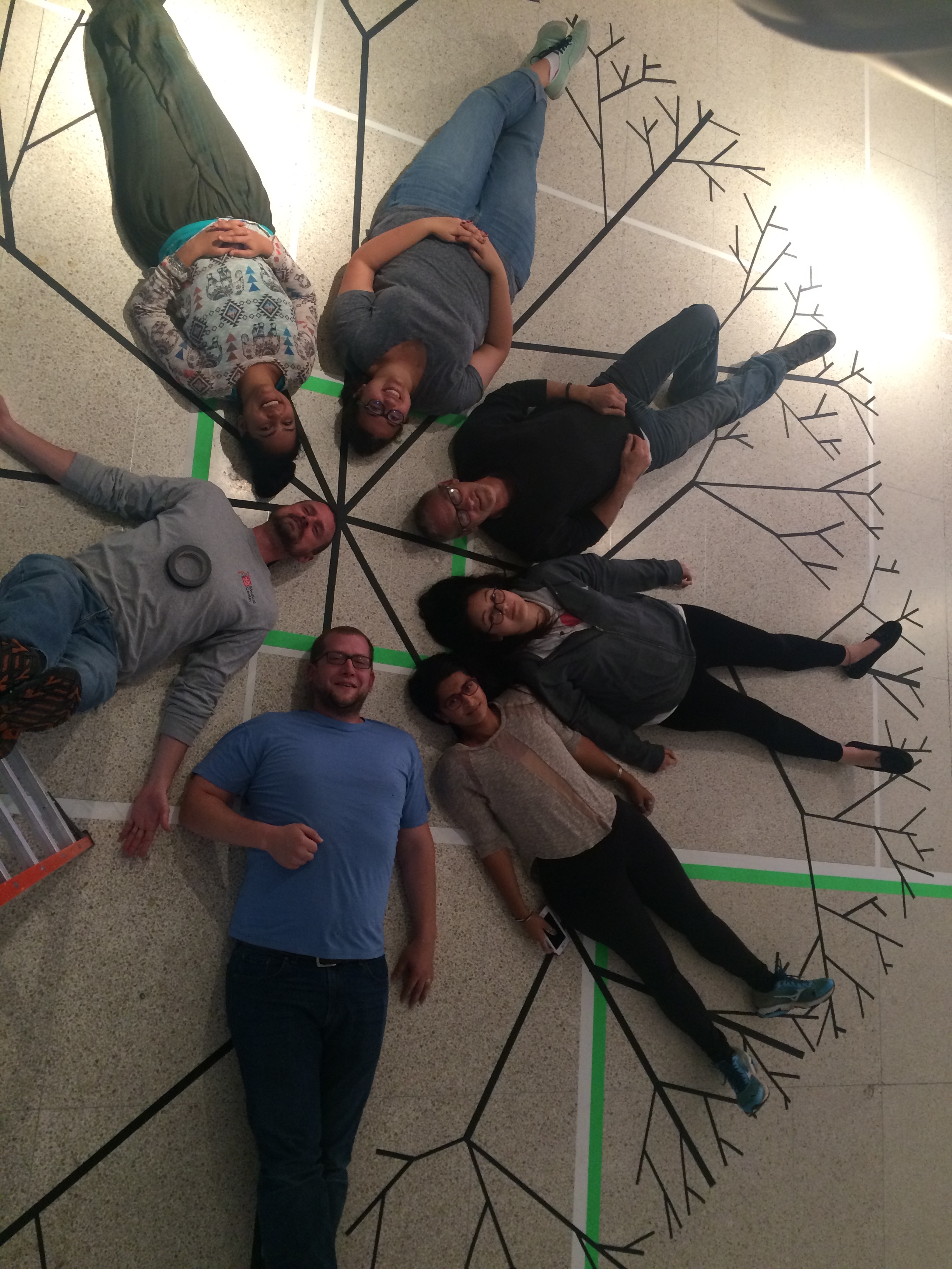
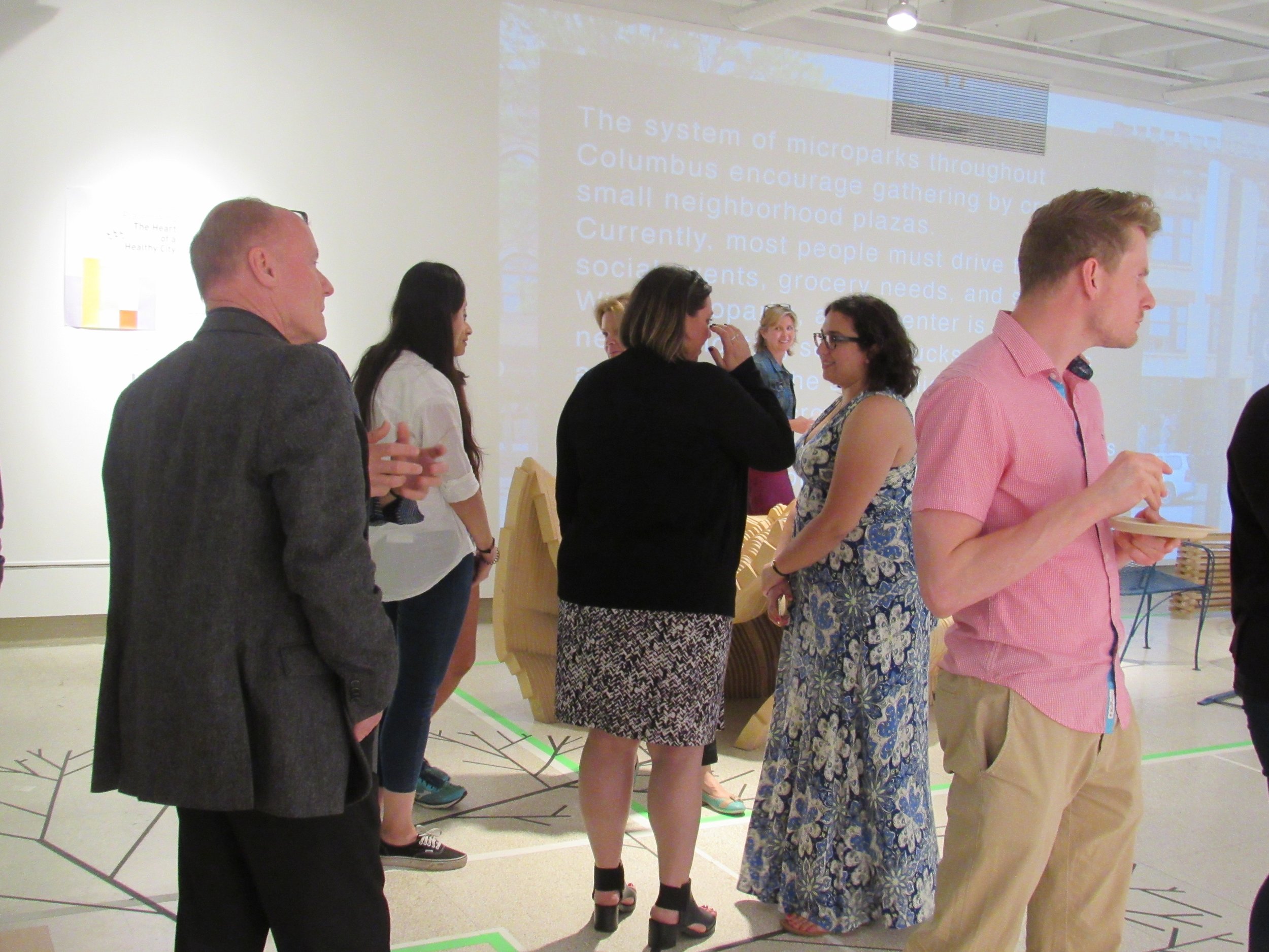
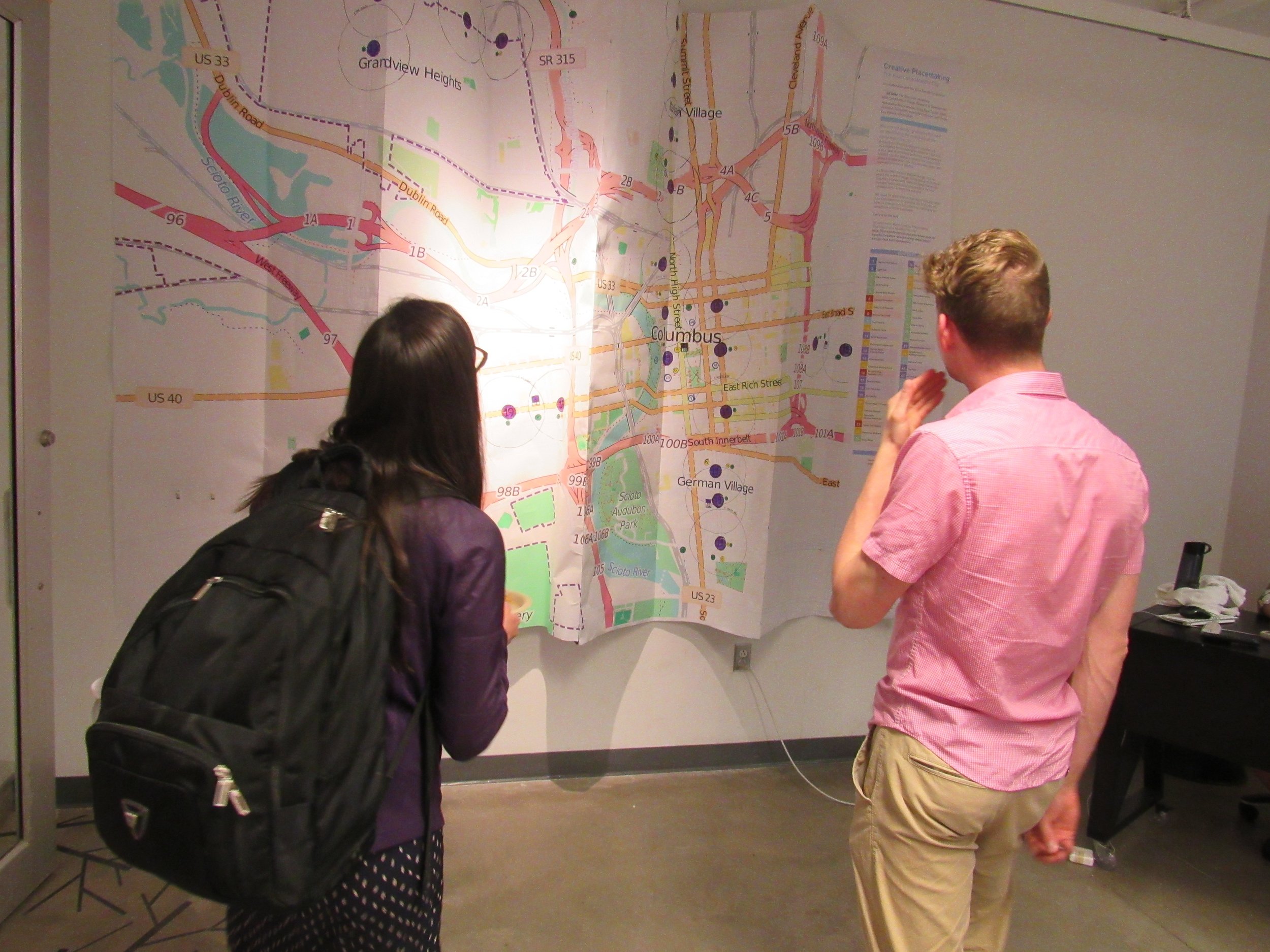
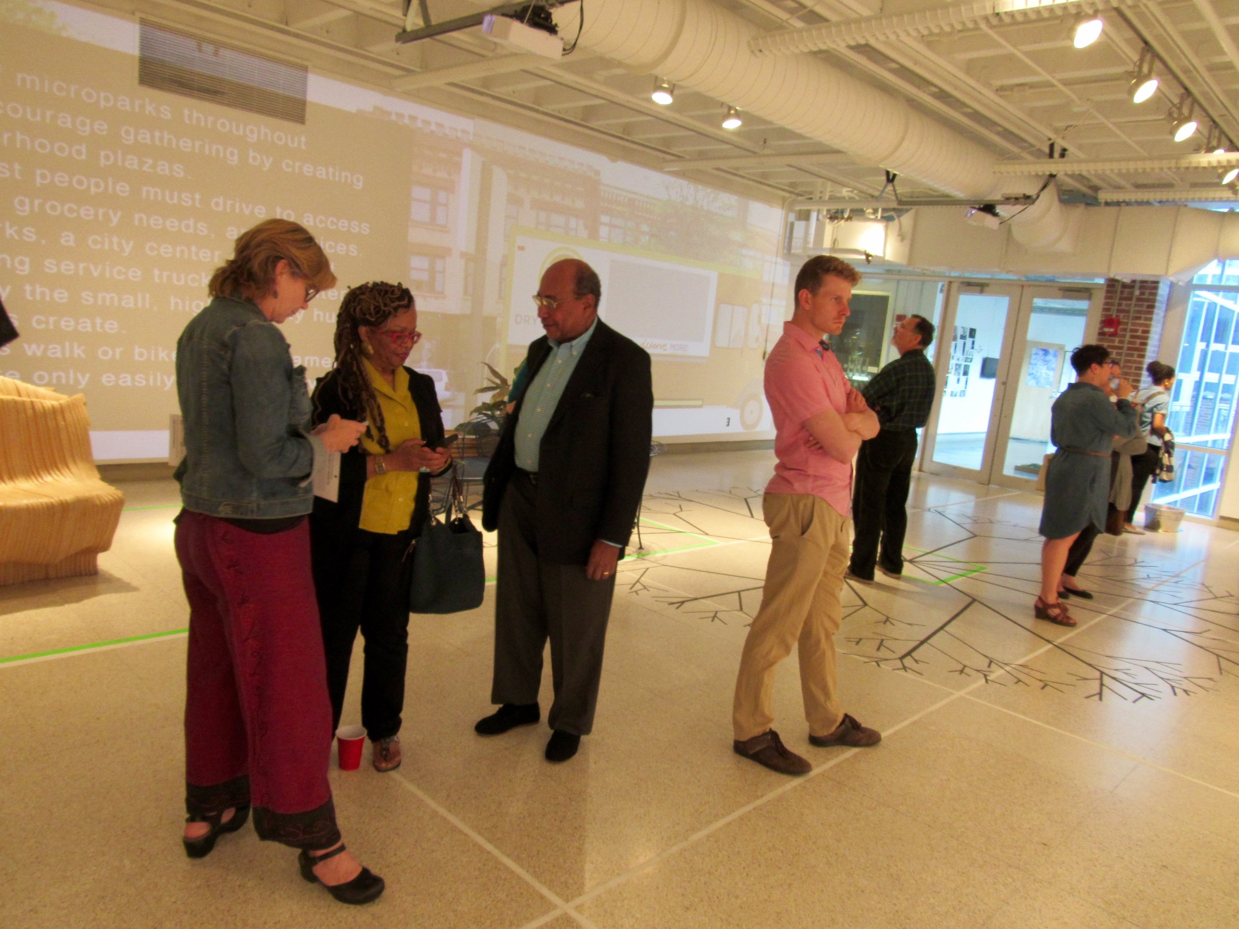
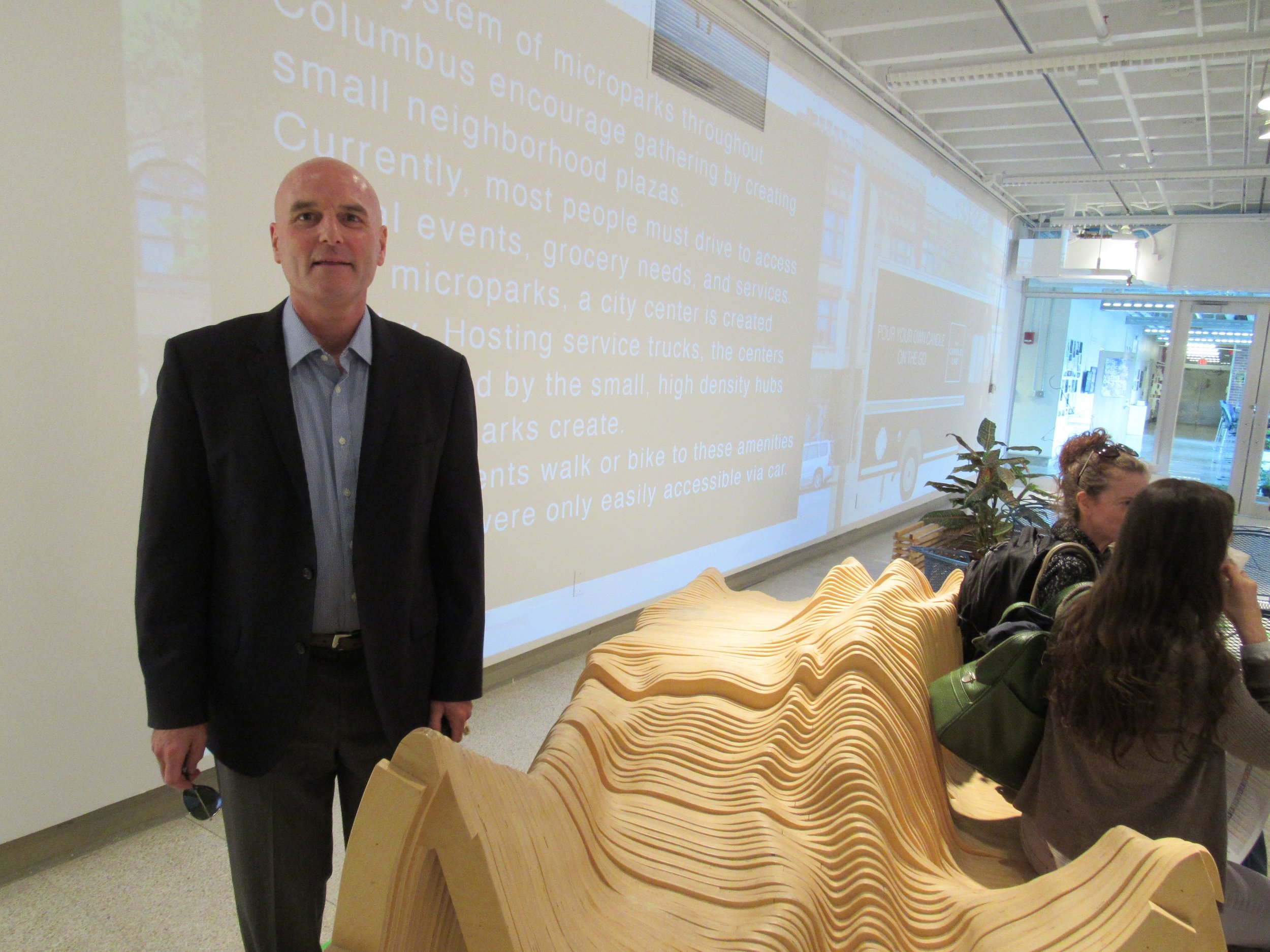
The gallery opening was a complete success with the audience interacting with the pieces at the exhibition!
GALLERY OPENING NIGHT!
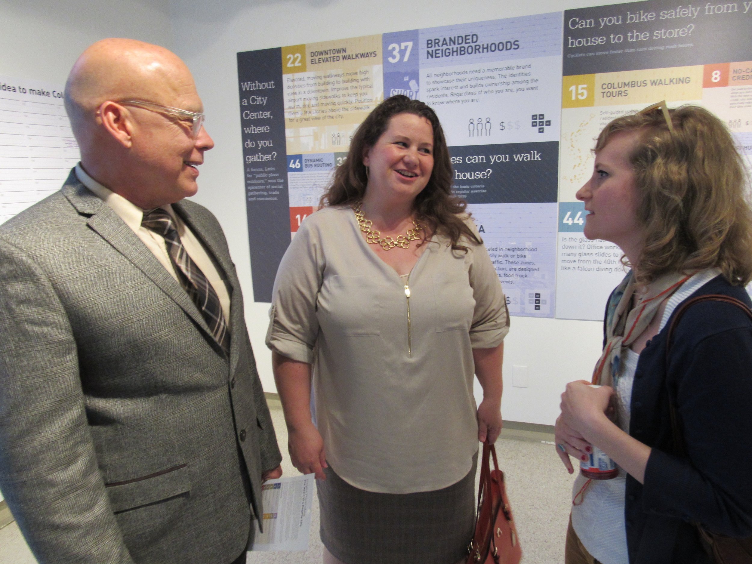
The exhibition posters were also displayed at the Design Department's Spring Show, 2017.


